Preparing for a 4k Web
High density displays aren’t anything new to the world of mobile and computing. However, 4k displays represent the last leg in resolution independence. High Density Displays (Retina) started in the mobile sector in 2010 when the iPhone 4 was introduced. The iPhone 4 featured a mind-blowing 326 Pixels Per Inch (PPI) display. Less than two years later, Apple followed the iPhone with the introduction of the Retina MacBook Pros and Retina iPads in 2012. Since then, nearly every smartphone on the market has a high density display as well as the majority of mid-range tablets.
So What is 4k?
For the uninitiated, 4k is a subset to the umbrella term Ultra High Definition (UHD) resolutions. The Consumer Electronics Association defines the Ultra High Definition of “at least 3840 x 2160 pixels (px).” Not all UHD devices are 4k but all 4k devices are UHD. Currently, a few hardware manufactures have concept displays sporting 8k resolutions.
4k display resolutions vary by aspect ratio, 3840 x 2160 px (16:9 Aspect Ratio) currently dominating the playing field. Other 4k resolutions include 4k Ultra Wide, 5120 x 2160 px (21:9), 4K WHXGA, 5120 x 3200 px (16:10) and the family of Digital Cinema Initiatives resolutions used for video cameras and cinema projectors (see 4k video editing software).
The term 4k originated with early 4k capable cameras like the Red Digital Cinema Red One video camera, which defaulted to 4096 x 2048 (2:1). In computer speak, translates to 4096/1024 = 4k, hence the term “4k.” The camera’s sensor was capable of multiple aspects ratios, all which fell within the 4k family.
4k does not mean one specific resolution, but most commonly refers to 3840 x 2160 px, for a staggering 8,294,400 pixels (8.2 Megapixels). A 4k display is 2x the height and 2x the width of 1080p’s 1920 x 1080 px resolution. When compared to 1080p’s 2,073,600 pixels (2.1 Megapixels). 4k is four times as many pixels. The term 4k may have started as a literal measurement of the horizontal pixel width but now refers to “(at least) four times the resolution of 1080p.”
4k displays range greatly in sizes to as low as 24 inches to as high as Samsung’s massive U9000, a 110 inch curved display. Due to the vast range of size, the PPI (Pixels per inch) differ radically. 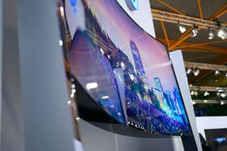 Photo by janitors / CC BY
The amount of pixels-per-inch defines how sharp an image is, the more pixels in a square inch, the more detail. Once a device or display has a high enough PPI, it is considered a high density display.
Generally speaking, a high-density denotes a display with at least 200 pixels-per-inch but this definition is not set in stone. Depending how close or far the device from the eyes greater affects how sharp an image appears. A laptop monitor doesn’t need to have as nearly as high of pixels-per-inch as a cellphone to appear to be a high density display. This is due to the fact most people sit much further away from a laptop screen than they do a cellphone.
Below are examples of 4k PPI at various sizes, common non-high-density display PPI and common high density displays PPI.
Note that an iPhone 3G has a higher PPI than most of the 4k displays and yet it is considered a non-high density display.
4k Pixel Densities at 3840 x 2160
24-inch -185 PPI
28-inch – 157 PPI
32-inch – 140 PPI
39-inch – 113 PPI
50-inch – 88 PPI
65-inch – 67 PPI
Common Non-High-Density Displays
2009 iPhone 3G / 3GS – 3.5-inch (320 x 480) – 163 PPI
2013 MacBook Air 11-inch (1366×768) – 135 PPI
2013 MacBook Air 13-inch (1440×900) – 128 PPI
2013 iMac 21.5-inch (1920×1080) – 102 PPI
2013 iMac 27-inch (2560 x 1440) – 109 PPI
Common High-Density Displays
2010 iPhone 4 – 3.5-inch (640 x 960) – 326 PPI
2011 iPad Retina – 9.7 inch (2048 x 1536) – 264 PPI
2012 MacBook Pro – 13 inch (2560 x 1600) – 227 PPI
2012 MacBook Pro – 15 inch (2880 x 1800) – 220 PPI
2013 Samsung Galaxy S4 – 5-inch (1080 x 1920) – 441 PPI
2013 HTC One – 4.7 inch (1080 x 1920) – 468 PPI
2013 Kindle Fire HDX – 8.9-inch (2560 x 1600) – 339 PPI
For brevity’s sake, 4k displays range in resolution and size. Not all 4k displays are high density displays. The PPI cut off point is still currently being debated. Likely, monitors below 28 inches sporting 4k resolutions will be considered high-density displays despite having pixel densities comparable to phones produced in 2008-2009.
By 2013 most major PC manufacturers introduced several models of laptops featuring high density displays. Some notable examples include Samsung’s 13-inch ATIV Book 9 Plus laptop which boasts a massive (near-4k) resolution of 3200 x 1800 px and Google’s Pixel Chromebook which sports a 2,560 × 1,700 px resolution. Both laptops feature a higher PPI than Apple’s MacBook Pro Retina models.
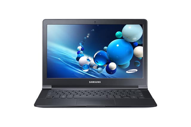
Photo by Samsung Belgium / CC BY
Photo by Joe Wilcox / CC BY-NC-SA
The high density display revolution until recently has been limited to high-end laptops, tablets and phones. Prior to writing this, price kept 4k displays out of the reach of most consumers but that has changed. 4k prices have dropped and dropped FAST. As of writing this, Seiki Digital’s SE39UY04 39-inch 4k display can be had for under $500. Dell has begun shipping a 28-inch 4k monitor for $699. 4k is here today and can be had even on moderate budgets. Rampant speculation has lead many to conclude that a 4k iMac is inevitable as well as “retina” MacBook Airs. High density displays are trickling down into mid range laptops as display prices plummet, and graphic chipsets become more powerful. All sources point to the conclusion, that all computers in the near future will be sold with very high resolution displays. This will happen sooner than one might expect.
Don’t Say DPI for Web Design & Development
You may have noticed that I’ve been using the term Pixels-Per-Inch over the old industry standard of Dots-Per-Inch (DPI). DPI is a legacy from the print industry, which means how finely spaced the droplets of ink can be in a print. The higher resolution a print is, the more DPI it has and thus the sharpness and detail increases. However, DPI is a term that becomes quickly muddied as digital displays do not display droplets of ink.
You may have heard that computer monitors are 72 DPI or 96 DPI. This is an old calculation method used by the operating system when converting pixels to inches using points, not actual printer ink dots that commonly associated with laserjet or inkjet printing. On screen, DPI translates pixels into inches: A 96 x 96 block of pixels is equal to one inch when printed. This most predominantly affected the scaling of fonts and user interface elements in Windows. Mac OS’s famous 72 DPI is rooted in the Macintosh 128k’s 512 x 342 px screen, which corresponded to the width of standard office paper (512 px ÷ 72 px/in = 7.1 in, with a 0.75 in margin down each side when assuming 8.5 in × 11 in North American paper size). One pixel was equal to one point unit in typography.
To deal with the wide-variety of displays that followed the original Macintosh, the screen DPI of the device became determined by the operating system. Today, the DPI is the default conversion for pixels to inches. DPI does not determine the PPI, and shouldn’t be used interchangeably with PPI. Images can contain data that determines the image’s intended DPI for printing. This does not affect how many pixels are in an image. Instead, this alters the default DPI calculation Pixels-to-inches when printing.
OS X/Windows/Linux today all use the standard metric of 96 DPI as its relatively close to the PPI of modern non-high-density displays. Retina display OS X devices report a DPI of 192, regardless of the PPI.
Designers/Developers familiar with responsive design may note that Media queries can be wrote to use DPIs as condition. Outside of particular instances these should not be used, as iOS, Android and some browsers fail to return DPIs. Internet Explorer on Windows RT regardless of resolution returns 96 DPI. When developing for the web, its best to forget the term “DPI” unless you need to print something.
So How Does 4k Affect Web Designers and Developers?
If you do not have a resolution independence strategy, I recommend developing one starting today. Rather than covering all the solutions available, I suggest reading Smashing Magazine’s “Towards A Retina Web” as a jump off point. Websites and web apps without high resolution assets often look “blurry”, “pixelated” or “fuzzy” when viewed on a high density display. The effect can be jarring and leads to a dated look when compared to web sites or apps with resolution independent images.
Fortunately, many of lessons learned from the high density display revolution are scalable to large screens, but not without its own caveats. 4k differs from previous high density display devices as its the first to adopt a wide range of physical sizes. 4k asks “When is a display a high density display”?
Before, common knowledge has been to treat anything with 200 PPI (device-pixel-ratio of 2) or greater as high density. However that may exclude any 4k users, even running on a 24-inch display as it may report a device-pixel-ratio of 1.5.
As of writing this, OS X support for 4k has been referred to as the “Wild West” due to the lack of resolution scaling modes. Windows suffers even more. Windows 8.1 offers more UI scaling options than previous iterations of Windows, but applications using custom dialog boxes may not respond to the UI scaling. Worse, depending on how the app was written, it may appear blurry. This will likely soon change, as the stress of demand causes Apple, Microsoft and others to react to meet the needs of the user base.
Much of 4k’s strategy depends on how Apple and Microsoft choose to handle 4k. We may see a subset adoption of “medium density display” to denote 4k users and low end tablets. Users will likely prefer to see the higher resolution assets even on “medium density display” devices. This does not mean that web developers will need to create medium density display assets. Instead, websites and apps will serve the high density display image assets to 4k users, to be scaled down to the appropriate size. This is important to keep in mind as any script based strategy (like retina.js or a content delivery network) may need to be tweaked to allow support for 4k users after OS X and Windows have finalized high density display support.
The best part is any resolution independent assets (vector) are ready for 4k users without a developer lifting a finger. SVGs, fonts and icon fonts are all resolution independent. Pure CSS attributes like borders, gradients and rounded-corners also are resolution independent. This means, any of these assets will be rendered at the optimal resolution regardless of what device they are displayed on. Leveraging these assets when possible will give you crisp looking websites and web apps regardless of resolution.
If you already have a resolution independence strategy for your website or app, you’re likely only a few keyboard strokes away from 4k support. As a leading digital innovation agency we also specialize in website and mobile app development for a 4k web. Waiting for Microsoft and Apple to finalize their paths to full-resolution independence should not delay any resolution independence strategies. 4k adds another layer of complexity to resolution independence but unshackles desktop PCs, allowing them to join the high density display revolution. Starting in 2015, NPD DisplaySearch forecasts that FPDs with 200-250 PPI will account for the largest share of TFT LCDs shipped. We may even see 4k laptops soon.
Summary
- 4k represents the last hurdle for resolution independence as it targets large displays.
- 4k displays have come down in price, making them attainable for average users.
- Neither OS X or Windows have full support for ultra high resolutions but this will change soon.
- Pixels-per-inch determines what is a high density display.
- The majority of all computers sold will feature high density displays (including desktops and external displays).
- Any high resolution asset strategy needs to be scaled from the small screen to the larger displays.
- Many if not most, high resolution assets can be reused for 4k users.