
The Best Component Library Tools to Help You Scale Your Product Consistently and Efficiently
- Product Design /
- Product Development /
- Product Management /
Julian Pscheid
As a product manager, you need an effective way to manage the user experience and user interface (UX/UI) of your digital product. It is essential that your digital product will scale effectively without requiring frequent additions or rework of design files and assets, while maintaining a consistent UI system. Several innovations over the last few years have helped reorganize the traditional UX/UI design process, and more recent innovations on the development side now allow for a complete design-to-development tool stack. This article will go over the most recent UX/UI design processes and the best component library tools that allow for tighter integration between design and development.
What’s the difference between design systems, style guides, pattern libraries, and component libraries?
These terms are often used interchangeably, but they refer to different aspects of the design process. Design systems have been around for a while, but are becoming more popular due to the shift to components in the development process, which has been accelerated by the popularity of the React development framework. Design systems enable people to take just the bits of the design system that are applicable to them and build the components that are missing more easily. It’s important to create a system that’s complete, flexible, and extensible so that it can be adapted easily.
Design systems holistically group all the elements that allow product teams to design and implement a product. Typically, a design system consists of the following parts:
- Style guide: A style guide focuses on the visual aspect of a product, such as colors, typography, icons, and spacing. It establishes a set of rules and guidelines to ensure visual consistency across the application or brand. Style guides may also include recommendations on writing style, tone, and voice to maintain consistency in content as well.
- Pattern library: A pattern library, also known as a UI library or design pattern library, is a collection of reusable design elements or solutions that solve common design problems. It includes UI elements, such as navigation, forms, buttons, and their variations, along with guidelines on how and when to use them. Pattern libraries help designers and developers maintain a consistent user experience by providing a repository of proven solutions.
- Component library: A component library is a collection of pre-built, reusable UI components or code snippets that developers can use to build a user interface. These components are often created based on the design patterns and styles defined in the pattern library and style guide. Component libraries help accelerate development by reducing the need to create UI elements from scratch and ensuring consistent implementation across the application.
While different design systems tend to group their deliverables differently, the core pieces should be included. A strong design system will also incorporate ‘subatomic’ parts, such as the grid system, color palette, and typography, which are commonly referred to as design tokens.
Let’s take a look at an example of some real-world design systems:
- Shopify publishes their design system, Polaris, not just for themselves, but for anyone who operates in the ecosystem of their eCommerce platform.
- Material Design is an extensive design system that bridges graphical guidelines, interaction patterns, and component libraries.
- GitHub publishes their design system, Primer, as an open source project. While it has a strong focus on the development aspects, it still includes a style guide, and pattern library. They even include templates for presentations and an iconography library.
- Atlaskit is the design system developed by Atlassian for its products. It is very exhaustive and includes a style guide, pattern library, and component library.
- Fluent is Microsoft’s open-source, cross-platform design system that gives designers and developers a framework to create engaging product experiences.
- Audi’s design system is of interest because it covers a wide variety of use cases, from phones to smartwatches and car displays.
How does using a component library improve the UX/UI design quality assurance?
Component libraries can be used for visual QA by visual designers once functionality is in development and before it is deployed into the application. Component libraries also enable UX quality assurance on how components function; this workflow can be collaborative. Edge cases typically can arise once real data is used in an application environment; by using a component library your team can catch more of those edge cases before they appear in your production application and more effectively address the UX required for modern stateful interfaces.
Component libraries typically include documentation that describes each component’s purpose, usage, and behavior. This helps developers and quality assurance teams better understand the expected behavior of the components, making it easier to spot and address issues.
Using a component library can also help when testing for accessibility. Many component libraries prioritize accessibility by providing pre-built components that follow best practices for accessibility. This means that the quality assurance team can be more confident in the application’s accessibility and spend less time testing these aspects.
How atomic design fits with component libraries
Component Libraries borrow some concepts from atomic design, so it’s important to understand some of its basics. In atomic design, design concepts are composed of modular and reusable components created from individual atomic pieces. Brad Frost describes atomic design:
Atomic design is a methodology composed of five distinct stages working together to create interface design systems in a more deliberate and hierarchical manner. The five stages of atomic design are:
- Atoms
- Molecules
- Organisms
- Templates
- Pages
Atomic design is not a linear process, but rather a mental model to help us think of our user interfaces as both a cohesive whole and a collection of parts at the same time. Each of the five stages plays a key role in the hierarchy of our interface design systems.
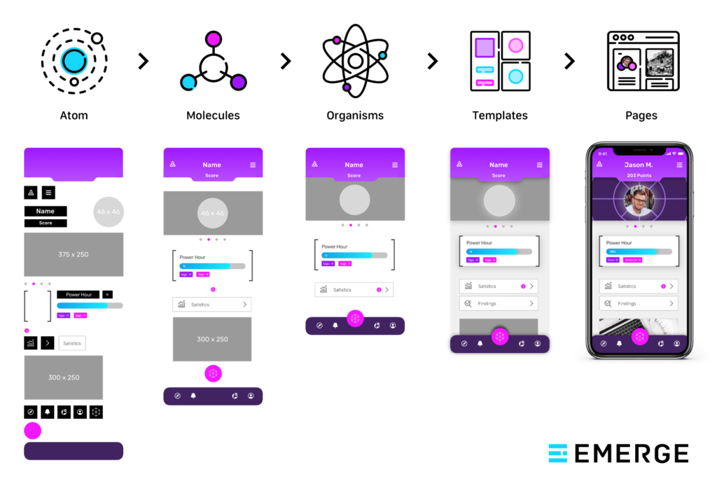
When connecting the atomic design practice with development, the resulting code is easier to read, contains less duplication, allows for more modular file structure, and improves the maintainability of the application. In particular, component libraries have become a popular tool to represent Molecules and Organisms as functional pieces of code that can be utilized in web applications.
Would my digital product benefit from a design system?
Before you implement a component library, you’ll need a completed design system. But is a design system the right tool to use for your digital product? Ask yourself the following questions and if you find that you are agreeing with several of them, your digital product is a good candidate for a design system:
- Does your product have multiple digital touchpoints (websites, web apps, mobile apps) that would benefit from a consistent interface design?
- Does your product team need to quickly release changes, new features, or new digital touchpoints?
- Are you growing fast and need to be able to design with a common language and consistent aesthetic that upholds your company’s brand?
- Do your designers tend to create outside of your brand aesthetic, making things very difficult to iterate and change over time and also adding both technical and design debt?
- Do the same things get built over and over?
- Does your product have inconsistent tooltips, confusing modal dialogs, and competing button styles?
- Do your designers ask the same questions time and time again?
- Does it take new designers, engineers, and product managers months to fully understand how to use the set design language?
- Are you looking to conduct more rapid prototyping?
- Do you have a set of accessibility standards for your product’s design that you need to uphold?
Does my digital product need a component library?
Not every digital product that has a design system would also benefit from having a component library. The following questions can help you determine if implementing a component library is worth the effort:
- Do you have a design system or are planning on creating one?
- Are your developers confused what UI or UX convention to use for interfaces? For example, what button, drop down, typeahead, etc. to use?
- Are your developers building the same design components over and over in slightly different ways?
- Do the different interfaces in your digital product share design components?
- Does your product team struggle with visual QA?
- Is your development team building an ecosystem of reusable atomic UI components (using React, Angular, or similar)?
- Are there inconsistencies in the way your UI components are coded, making it hard for different developers to work in different areas of your product?
- Do you have trouble distributing and versioning atomic UI components after they are coded?
If you found yourself agreeing to multiple of these questions, your digital product likely would benefit from a component library.
I have a design system, but how do I add a component library?
If you are ready to take the leap, congratulations! First off, ensure that your design system touches on all the required components:
- Purpose and shared values: Create a vision to ensure the design moves in the right shared direction. Follow these critical steps to define your product’s vision.
- Design Principles: These help teams with decision making and guide your team toward making appropriate decisions.
- Brand identity & language: The identity should be defined in line with the strategy and the objectives of the brand. This is often the very beginning of a design system for many businesses or organizations, helping define things like typography, colors, and more. Follow these steps to define your digital product’s brand strategy.
- Components & patterns: These are at the heart of the design system. All the previous elements will help you to create them and deliver a consistent experience.
With this in place, you can start working on your component library:
- Create a plan for what parts of your design system you want to represent in the component library. You can include different levels of atomic design, such as only atoms or everything up to organisms. Ideally, this is prioritized to maximize your return on investment, including prioritization of the most commonly used or shared components in your library.
- Decide if you want to leverage an existing component library tool and, if so, select which one to use (commonly used tools include Storybook and Bit.dev; more on those below).
- Determine the hosting and governance of the library. Different tools will push you towards different options. Since your component library will be a shared resource that is likely utilized by more than one application in your ecosystem, it will need to be set up as a standalone, semi-autonomous entity–essentially like a web application itself. As such, it requires hosting infrastructure and the typical governance policies associated with a web application (source control, continuous delivery mechanisms, etc.). Teams other than development will need to be able to access this, so plan for it to be available to them as well.
- Decide on a distribution method, such as npm. This establishes how the code for a shared component is ported into the software applications that want to use them.
- Make sure you have a governance plan for the development lifecycle of each component, from build to release. Also, consider component dependencies.
The best component library tools to develop independent and reusable components
You could build a component library from scratch, but fortunately, there are several tools that can help you get a jump start. Here are our favorites that you should check out:
StoryBook
Storybook is an open source tool for developing UI components in isolation for some of the most popular JS frameworks (React, Vue, and Angular). It provides a sandbox to build and showcase UI components, provides visual previews of components, and runs tests on them. It is widely used, popular, and considered a mature software product.
It also supports add-ons, which can extend its utility. For example, the “knobs” add-on allows editing the props passed to a react component, thus enabling testing and viewing the component in different UI states.
Since it is an open source product, StoryBook does require setting up and managing your own hosting infrastructure to run it.
Bit.Dev
Similar to Storybook, Bit.dev provides a workspace to create visual components. It has a greater focus on isolation and more features around the full lifecycle of component development. It too allows for a visual preview of components, supports the most popular UI frameworks (React, Angular, Vue, etc.), and allows running tests. Bit.dev can work with StoryBook, or as a standalone tool.
Since it’s a commercial product, there is a hosted service option in addition to an on-prem option. The hosted option creates a low barrier to entry and reduces long-term infrastructure management. It also includes automatic deployment and additional collaboration options that the self-hosted tools do not provide.
Bit.dev defines, and can handle the full lifecycle for components: test, build, version, and distribute. It provides continuous integration (CI) for each component, in the cloud. It also includes built-in hooks for NPM and other distribution tools, which may save time. Compared to other tools, Bit.dev is geared toward greater isolation of components, where changes and versions are tracked per component. It also provides dependency management. Business level accounts start at $25/month per user.
Backlight
Backlight is a newer product that competes with Bit.dev’s hosted offering. It offers an all-in-one solution that promotes collaboration between developers and designers by providing instant sharing capabilities, component-driven development, and built-in release management and documentation support. The platform comes with starter-kits in various languages such as React, Vue, Svelte, Web Components and more languages on the way.
Backlight.dev allows multiple team members to work simultaneously on design systems and components, enabling seamless collaboration and reducing the time taken to create and iterate on designs. The platform also offers a live preview feature that allows designers and developers to see the impact of their changes in real-time, ensuring that the final output meets their expectations. They offer a free account level, and business level accounts start at $149/month.
React Styleguidist
Styleguidist is another open source tool that is self-hosted. It facilitates isolated component development and is similar to StoryBook in features, but uses a slightly different technical approach, and only works for React. It allows visual previewing of components, runs tests, and allows you to model state, similar to the “knobs” add-on for StoryBook.
One feature that particularly stands out to us is how easy it is to create docs and controls as Styleguidist parses the source code and readme files to auto-generate docs. The output is generated in the JSdoc format.
Stencil
Stencil.js offers out-of-the-box features and documentation that can help build a library of universal UI components that can be used across platforms, devices, and front-end frameworks. Compared to other products listed in this article, Stencil.js is more focused on generating web components (although it does offer integrations for React, Angular, and Vue) and does the work of generating and documenting them in code. It provides a toolchain for building a component library of web components, but does not provide a visual preview of components.
Getting started with atomic design and component libraries
If you are interested in setting up a component library for your digital product, now is a great time to do so. The popularity of atomic design helps design teams structure design systems in a way that can be easily understood in terms of components. And the availability of several robust component library tools provides a good starting point for setting up your own UI library. If you are just getting started with your digital product’s design system, learn how to develop an effective digital product brand strategy in five easy steps. Also, don’t forget about the developer experience for engineers outside of your core product team that might engage with your product.